Tuesday, April 10, 2018

Multi-Media Seascapes


Second grade artists created mixed media collage seascapes.


These seascapes incorporated tempera painted paper, watercolor paper backgrounds, and origami.


First, classes created community painted papers to share. The objective was to use paint and texture combs to create the mood and appearance of water. Students chose whether the water looked calm, stormy, had waves, etc., and used both colors and textures to show it. Additional community papers in a variety of colors and textures were created to add land, features of the sky, sandy beaches, rocks, and more.


Next, artists envisioned a time of day, and painted a new piece of paper with a watercolor sky to match their vision.  After skies were created, students made at least two sailboats using this easy and effective set of origami instructions.  The sailboats needed to be different sizes. Students who loved this step created whole fleets of boats!


When all of the different pieces were prepared, students tore and cut the painted paper into long strips, and overlapped them from top to bottom to create waves and distance in their work. Paper that was torn created the look of white caps on the waves.


Boats were tucked in between the waves, the largest ones closest to the viewer, as objects appear to become smaller in the distance. The artist in the work above also added tiny trees on an island to give us a sense of distance. Other artists created items in the foreground, such as beach umbrellas, shells, starfish, coolers, grasses, and more. By comparison in scale to the other elements, these close-up items let us know that the boats and islands are far away.


Many students added additional elements to support the time of day in their picture, such as the moon, sun, or stars in the sky.

Monday, March 26, 2018

Matisse-inspired Paper Collages


A flurry of colors and forms, the cut-outs of Henri Matisse inspire many artists. Primarily known for being a famous painter, Matisse began cut-outs as an art form in their own right out of sheer necessity.
From Moma.org
A little history: After illness and surgery left him bound to his bed and a wheelchair, he began to instruct his studio assistants to make large sheets of painted papers which he cut into shapes and arranged into compositions with a board and tacks. He had his assistants arrange larger works directly on the wall.


Students looked at several examples of his work, and how he used line, shape, motion, variety, and balance to create successful compositions.


Artists here at EES used a variety of geometric and organic shapes as well as multiple types of line.


The elements and principles of design in art are part of any art curriculum. Used together with thought, they help us feel the artwork. The artist who created the collage below has combined the elements of shape and line to create an energetic, springing effect which displays the principle of movement.


In the image below, there is a repetition of straight lines and triangles in a rainbow of colors. The visual emphasis made by the repeating lines and shapes quickly and effectively draws our eyes to look at them.


 Like Matisse, students used positive and negative spaces to create their shapes and lines. The artist of the work below has used negative space to create both wavy and zigzag lines, letting the layer underneath show through a gap left between larger pieces. The high contrast between many of the colors, such as the red on blue, draws our eyes.


Learning the elements and principles of design helps each student grow visual vocabularies to discuss what they see, what they like, and what they want to create.


Friday, February 16, 2018

Winter Fine Arts Night


Last night Edmunds Elementary School held our Winter Fine Arts Night for grades three, four, and five.

 Third and fourth grade students displayed sculptures of birds and self-portraits. It was a highlight for students to use real tools, including drills and hot glue, to create their work. 


Fifth grade students displayed light-up paper circuits, multi-layer prints, chalk pastel abstractions, and hand-sewn monster dolls.


Artwork is hung primarily on bulletin boards and large paper panels. 


Sculpture is displayed on the tops of lockers and on display tables. Some bird sculptures hung from the ceiling.


At our school the art show gets paired up with the concert for well-rounded Fine Arts evening, which helps mutually increase attendance to the event. The hallway was packed!


The concert included a traditional Sioux lullaby and folk songs from Jamaica, Germany, and South Africa. Our fabulous music teacher Betsy Nolan led an amazing finale of of the song "Hall of Fame," accompanied by student teacher Emily Luce on piano.


The two-dimensional artwork will stay up for a couple more weeks, so if you want to get a peek, stop by.


Wednesday, February 7, 2018

First Grade Still-life: Composition and Blending


Artists in first grade drew and painted a variety of natural and man-made objects


Students used their hands as view-finders, like a camera lens, to "zoom" in and out and learn to crop their image to a specific composition of their own choosing, including or excluding elements.

This artist has zoomed in closely to the fruit, cropping out part of the pitcher.
Students used pencil to sketch and oil pastel to blend colors on the objects.


The composition here is zoomed out, showing the whole table and all the objects on it.


Green apple and red pear peeking out from the side of large white pitcher.


Students used warm and cool watercolors to create the backgrounds. The warm colors were used for the surfaces, and the cool colors created shadows cast by the objects.


Finally, students outlined the objects in black oil pastel to create visual "pop" and delineate edges that might have disappeared during blending or painting.


Friday, January 26, 2018

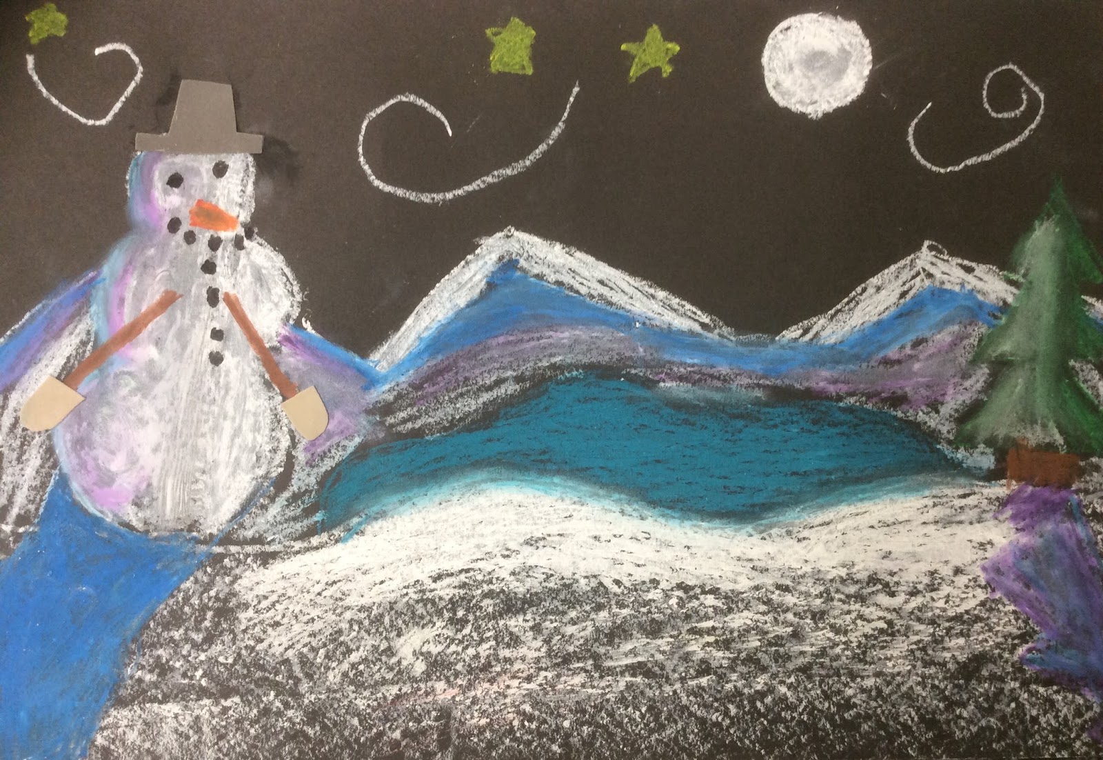
Winter Landscapes

We are deep in cold here in Burlington, and a perfect time for second grade to explore how color and light effect a winter landscape. 


Artists began by considering the time of day and light source in their landscape. 


All students added a snowy or icy surface. 


Artists used white a a base color for the snow and ice, then added shades of grey, silver, blue, and purple to create shades. 


These dark spaces on the form and surfaces are always opposite the light sources.

Moon (with craters!) on left, darkness and shadows on the right on the snowman.
The medium is oil pastel, and it allowed students to do some pretty incredible blending.


Afterward, lots of additions were made to landscape, such as creatures and people, mountains and houses.

Moon glowing on an lake!


Wind and snowflakes swirling around
Students discussed gaze direction- how to make the subject clearly looking in a specific direction, which in turn guides the viewer's eye. Below, the snowman gazing at the moon encourages us to look at what the subject is seeing.


Gazing right at us, the viewer, and we look back.

Gazing downward.

Check out the tree's reflection on the icy pond!


Students used cut paper and fabric to add details to their picture, particularly on the snowmen.